The exhibition entitled “Penmanship” presents the work of two painters, Tomáš Absolon and the Polish artista Cezary Poniatowski. The invitation of Cezary is a result of seeking somebody who share the same principles regarding how images are thought as Tomáš. Both painters move on the border between abstract and subject-oriented painting as a position appropriate for capturing their relationship to reality and corresponding to their conception of a two-dimensional work. Absolon presents a new series of drawings and images prepared just for this exhibition. The creations of Poniatowski represent works of various ages, updated installations including murals. The connecting moment is the way the image is handled, similar to that of poster design and its aesthetics. Simply put, the works are comprised of images and motifs, typography, colored spaces and sometimes decorative elements. Transferring the structure of a poster onto that of a painting (including working with information/text, as is typical of a poster) becomes an instrument for a clear, fast expression of the work.
The name of the exhibition, “Penmanship”, would be translated into Czech as meaning calligraphy, the art of handwriting. The meaning of this word, however, is more general - it is based on handwriting as the expression of a certain individuality and personality, not necessarily at the level of calligraphy. It is precisely typography and the use of hand-drawn lettering that is the most remarkable element in the Absolon and Poniatowsji exhibition. Generally, favoring of lettering and typography is apparent for the entire generation of artists connected with the abstract ar movement, and the letters or motifs of calligraphic signs are used currently by many artists in combination with abstraction. The diversity of approaches is represented, for example, by Aaron-Garber Maikovska, Florian Meisenberger, Julie Mehretu, Kerstin Brätsch (DAS Institut), David Ostrowski, Stefan Sander or the genderation of painters born during the 1950s – Albert Oehlen, Christopher Wool, Jonathan Lasker, Clen Crosby, Amy Sillman, etc. For some of these artists, the letter or sign is closely related to drawing, and becomes a signifying element in the hierarchy of the image. The traces of rapid performance of these drawings recall automatic writing or meaningless scribble (Ostrowski, Mehretu, Maikovska), similar to the smudges of one’s fingers when one scrolls through the screen of a smart phone or iPad, or “painting” with a “brush” in a computer graphics program (Oehlen, Meisenberger, Brätsch).
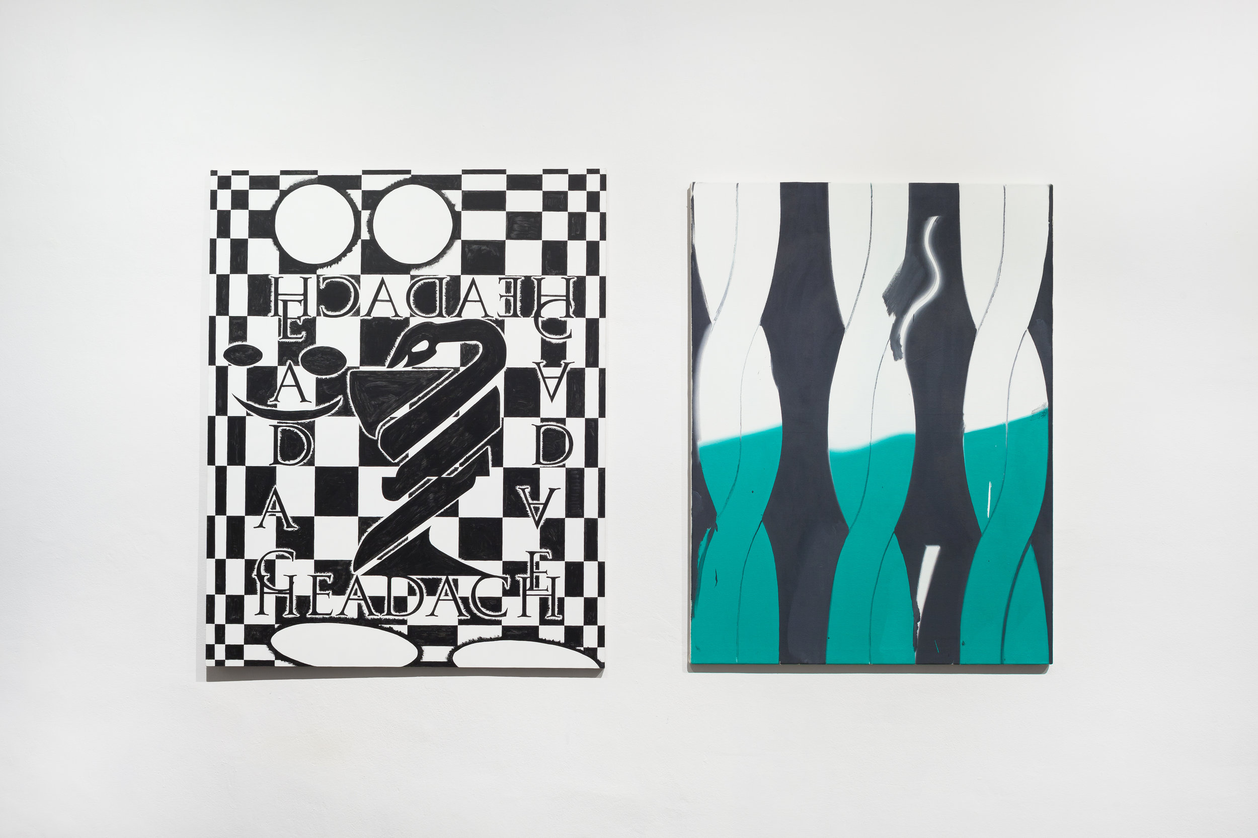
In Absolon’s case, this is work with backgrounds and fonts (e.g.. Bar Mauri; Madrugada III, both 2016), which are inspired by the environment of the bars in Mallorca. “I do my best to avoid surrealism by always thinking about these matters as if it were all a poster. Those rules give me certain limits for how far I can go,” Absolon says. Absolon is also currently working on his own font. As for Poniatowski, some of his structures recall old graphics programs and the softwards environment of the 1990s, including the basic elements they offered – checkerboards, circles, ellipses, wavy lines, etc. (Headache, 2016; Weltschmerz, 2016). “Writing or typography in my paintings sometimes is like a nihilistic, trashy comment on the situation depicted, but it also happens that there is no clear connection with the scene in the picture. Different words are collected during sketching and collecting ideas. Sometimes the typography is arranged as a structural element of the scene, sometimes it is added spontaneously and instinctively. It works like the text on a street poster and at the same time can go unseen. The nature of typography in my pictures is very ambivalent.” Poniatowski says. The story of his images is ascetic, raw, and works with the easily recognizable principles of comics and illustration. His character evoking the fabulous figure of the “Minotaur” is a symptomatically chosen allegiry for alienation and estrangement in today’s society. Similarly, it can recall the animated figure of Bugs Bunny, especially in the variation of Weltschmerz (2015) in his classic pose of recline with a carrot in his hand. Instead of vegetables, what is placed in this ironic context is a classical painting. “I know the characters in my pictures can remind us of the Minotaur (my inspirations are taken from many stories, from pop culture, history) but I prefer to see a person with a huge smile instead. My work is based on many sketches, quick ones I make in my notebooks. I collect many photos taken from the Internet on my phone. It is like an encyclopedia of craziness and oddity. I also use my computer when I am working on new pictures. Sometimes it helps me to have the pictures painted in a very automatic way, like a graphic print,” he says.
Text by Monika Čejková
———
Tomáš Absolon ( * 1987, Uherské Hradiště, Czech Republic )
The artist is a graduate of the studio of drawing and the school of Jiří Petrbok at the Akademie výtvarných umění in Prague (Academy of Fine Arts, Prague). He currently lives and works in Mallorca.
Cezary Poniatowski ( * 1987 Olsztyn, Poland )
The artist is a graduate of the graphic design studio of the Akademie Sztuk Pięknych (Fine Arts Academy) in Warsaw, Poland. He lives and works in Warsaw.
Curator:
Monika Čejková
Full exhibition
16/12 2016 – 17/2 2017, Kvalitář, Prague – Czech Rep.